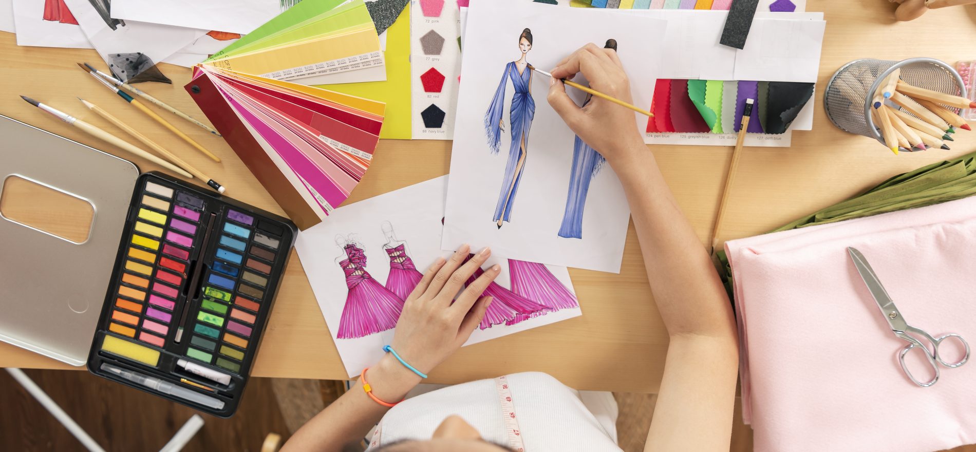
Fashion is an instant language. Without having to talk, you may express who you are via your style. Being admired for your fashion sense is what defines elegance, not sticking out. With the help of principles of principles of design in fashion designers and trendy people provide you with fashion four or five times a year.
The public’s needs and emerging trends must occasionally be taken into consideration by designers when they build new styles using principles of fashion. They must use elements and adhere to design standards while achieving this. Continue reading this article to learn about the principles of design in fashion or if you want enroll in Diploma in fashion designing. Enroll Now!
Table of Contents
- The Principles of Design in Fashion
- Emphasis (Focal Point or Centre)
- Balance
- Proportion
- Unity (Harmony)
- Elements of Fashion Design
The Principles of Design in Fashion
It looks breathtaking when models and famous people walk down the runway wearing amazing designs. But did you know that such beauty is only possible by adhering to a rigid set of rules?
The design language consists of a logical and complicated set of rules. Principles of Fashion enable designers to create works of art from any garment. These fashion design principles are in charge of providing fashion designers with the framework they need to make lovely settings.
A fashion designer must apply these ideas to create fashionable apparel that is both practical and fashionable, whether it be dresses, skirts, pants, shirts, suits, or combinations. What do these aspects and rules of clothes design entail? In this piece, let’s investigate them.
- Rhythm
- Emphasis (Focal Point or Centre of Attraction)
- Balance
- Proportion
- Unity (Harmony)
Rhythm
The repeating of visual patterns is referred to as rhythm in fashion design. It is also known as recurrence and is a continuation of organized movement. Rhythm in fashion design has four components that work together to give the design a feeling of energy and activity. These cause the eye to go from one element to the next.
Repetition: Repetition is when an element is used repeatedly across a design. It’s a great approach to guide the viewer’s attention through a design. Multiple instances of color, pattern, line, texture, or any other feature appear across a design. These may be used in combination to generate visual rhythm repeatedly.
Progression: When a designer applies a gradient to one or more of an element’s properties, they have generated progression. Size adjustments may be made to components like form, line, and color. As repetition might appear tedious without variety, this adds visual appeal.
Transition: A visual feature that smoothly and quietly transfers attention from one place to another is referred to as a transition. Curved lines can be used by a designer to create this appearance. Another illustration of repetition with variety is this.
Contrast: Contrast is another version in which two opposing components are placed next to one another. Examples include putting black and white patterns on clothing or combining squares and circles in a design. This idea may be startling when used incorrectly and vivacious when used well. It must be used delicately to prevent coming across as overwhelming.
Emphasis (Focal Point or Centre of Attraction)
This crucial component of fashion design highlights a certain area of the body or article of clothing. This is accomplished in a variety of methods, including the use of diverse sizes, colors, textures, forms, etc. The decorations that fall under this category include sequins, cut-outs, peplum skirts, ruffled sleeves, and more. This increases visual appeal in one region while detracting from the other areas’ visibility. A halter-neck dress or top is an excellent choice if you want to draw attention to your shoulders. The skirt’s ruffled and flared features serve to detract from the upper torso. The leg-of-mutton sleeves that graced bridal dresses in the 1980s are a common illustration.
Balance
Balance in fashion design is essentially an equal distribution of visual weight in the world of fashion. This idea is applied by designers when making seams, hemlines, and other details. These connect to the idea of internal homeostasis we have in physical terms. If this idea of balance in fashion design is not properly used, the spectator will feel uneasy and the design will look shaky. Because of this, it’s critical to efficiently arrange the intricacies and components of a garment with this idea in mind in order to achieve overall stability. Asymmetrical and symmetrical balances are the two primary types of balance in fashion design.
Asymmetrical: When a designer repeats an arrangement of design components in an asymmetrical or informal balance, it creates the appearance that the objects are not equal. Asymmetrical balance is challenging to implement well. One-shoulder dresses, for instance, might convey interest. Would a jacket with one lapel that was bigger than the other, though, still look good? No, is the response.
Symmetrical: When specific parts of an object are evenly repeated in an arrangement of design components, symmetrical or formal balance is produced. They appear to be on an equal footing because of how this is done. A straight hemline, for instance, is symmetrically balanced since it appears the same from all angles.
Proportion
The ratio of one element to another in a design is referred to as the principle of proportion. It aids designers in deciding how big and how small certain pieces should be in relation to one another to provide a pleasing overall impression. When several components (amounts, sizes, or numbers) link to one another, a sense of unity is produced.
When drawing an automobile, the tyres must be made in proportion to the rest of the body. As a result, there is a somewhat harmonic relationship between the tyre sizes and the body of the automobile.
Similar to this, it appears excellent when two or more components (such as colors, numbers, and sizes) are made in the right proportion. If this idea isn’t used, the finished design could appear odd and “out of proportion.”
The ‘Golden Mean’ or ‘Golden Ratio’ criterion serves as the foundation for this tenet. This was created by Greek mathematicians and is crucial to many design-related areas.
Unity (Harmony)
The notion of unity in fashion design is applied by the fashion designer when they intertwine all the components so that they function as a single design language. Harmony in fashion design is another name for this. An outfit looks decent overall when this is done well.
Instead of drawing the focus away from the design, each piece of the design complements the others. This idea of harmony in fashion design makes sure the design doesn’t appear disorganized or lifeless. The basic objective of any design is to establish the greatest degree of harmony between the elements.
Elements of Fashion Design
The foundation of a design is made up of its elements. Art elements are one of the elements that interact when making a design. The components and tenets of design are adaptable and have to be understood in light of current trends. An arrangement of lines, shapes, colors, and textures that produce a visual image is referred to as a design. The rules that control how elements are put together are known as design principles. Therefore, the basic ingredients that must be successfully integrated are the elements.
The following are the different elements of fashion design:
- Line
- Form
- Shape
- Space
- Texture
- Color
These components are referred to as “Plastics” in the language of art because the designer may manipulate or arrange them to produce the desired illusions.
If you love the article and would like to join our fashion designing course. Join Now and make a successfull career ahead.


